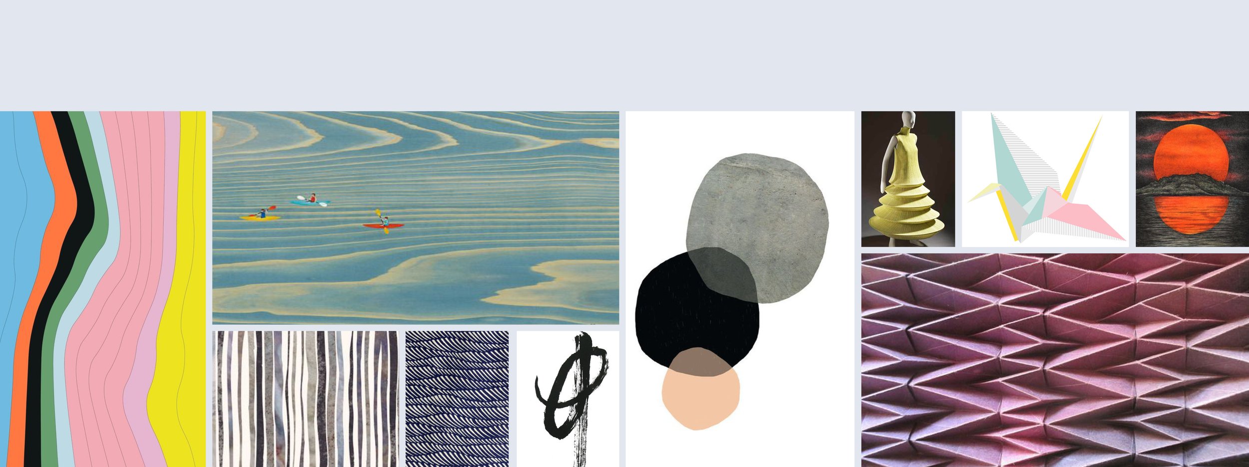
Guggenheim Partners Japan Market Branding
Creative Direction
To align with cultural sensibilities, the local Japanese office requested a custom visual identity targeted to their client demographic. After extensive research, my team and I developed three design concepts — focus, overlay and organic — that incorporated purple, Guggenheim’s primary color, with fresh graphics. The focus concept featured the Japanese flag; the overlay concept included origami and fashion; and the organic concept — which was selected by the stakeholders — incorporated brush strokes in a garden design.
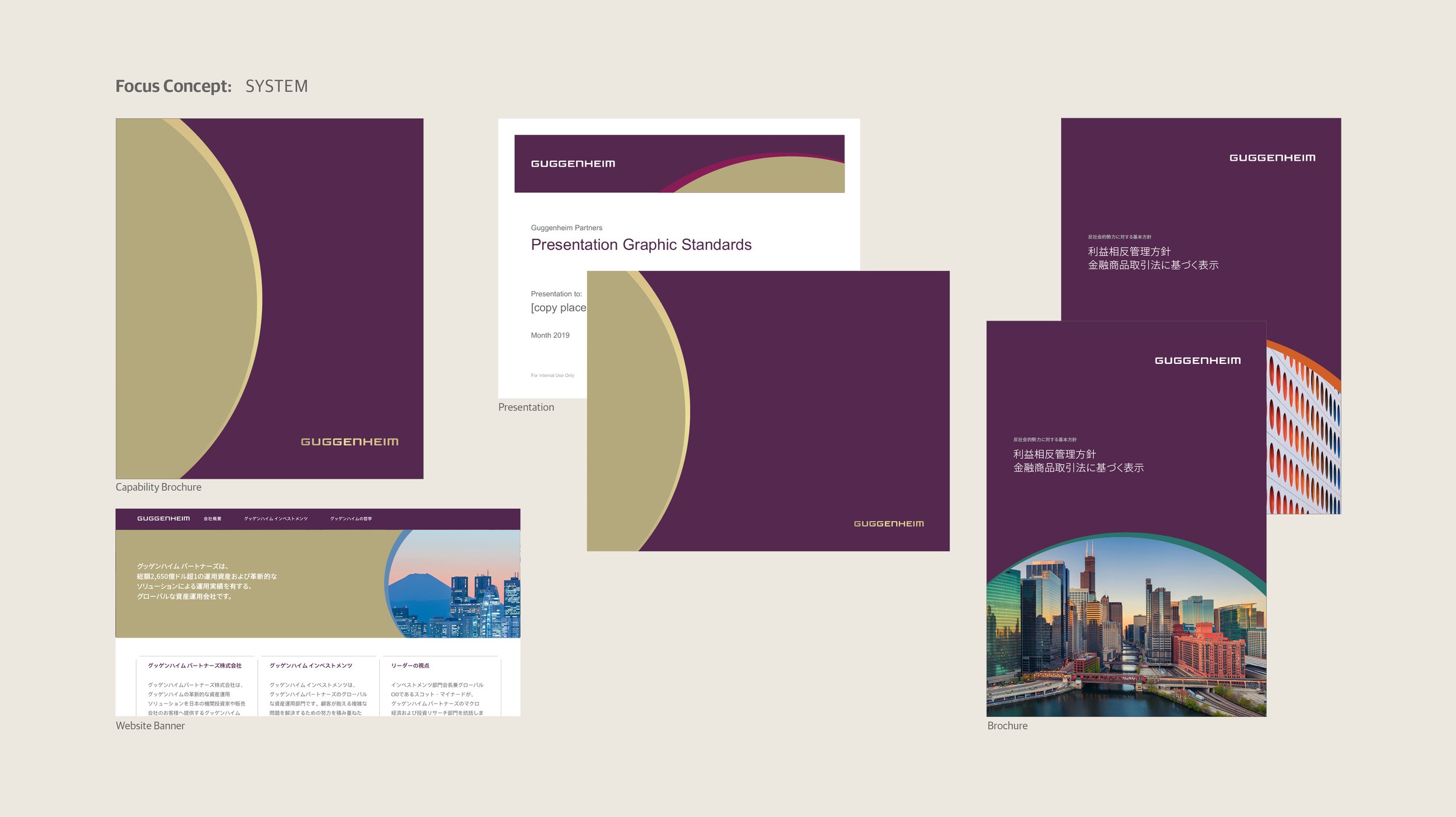
Design Direction: "Focus" Concept (Collateral Sample)
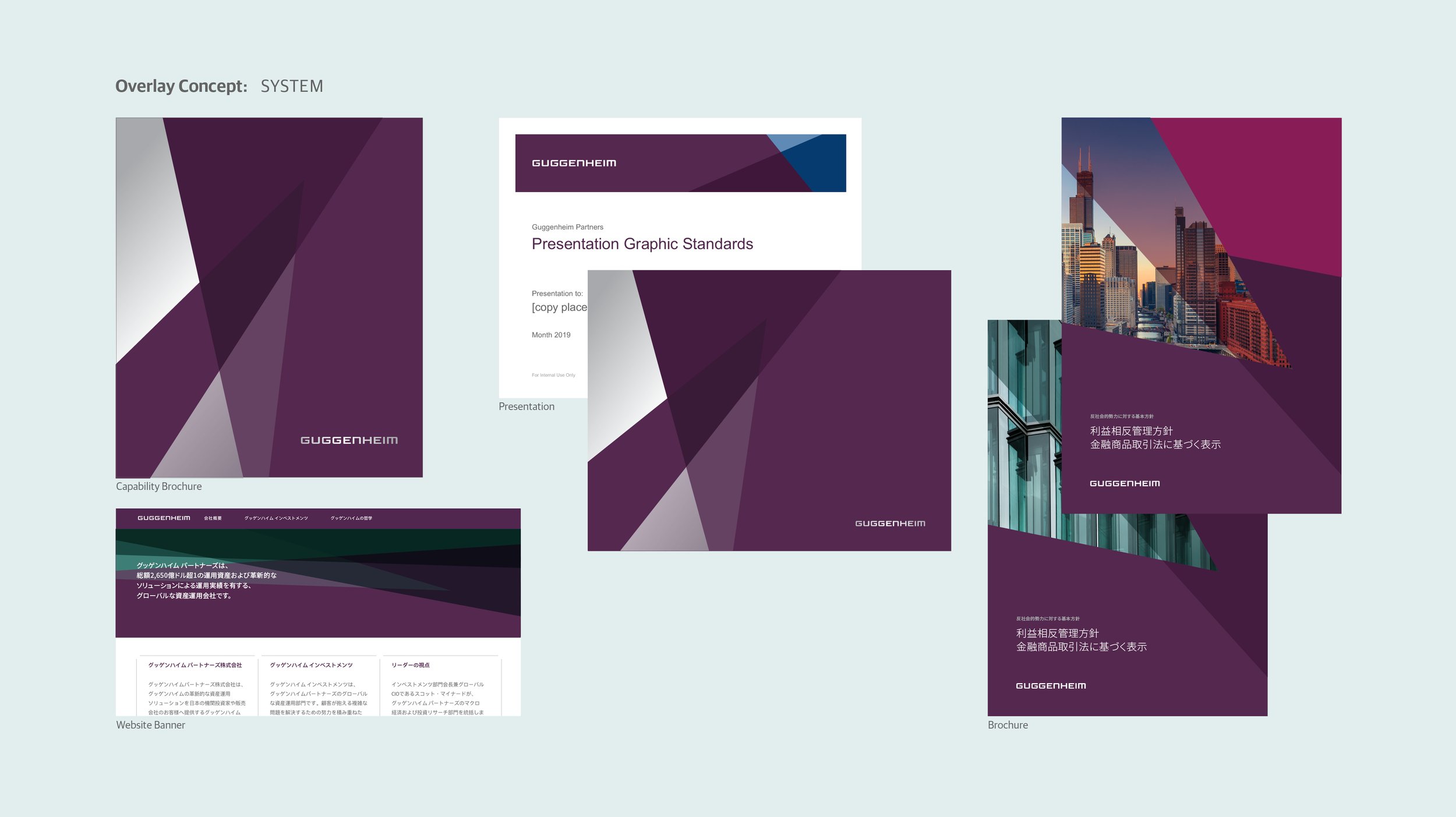
Design Direction: "Overlay" Concept (Collateral Sample)
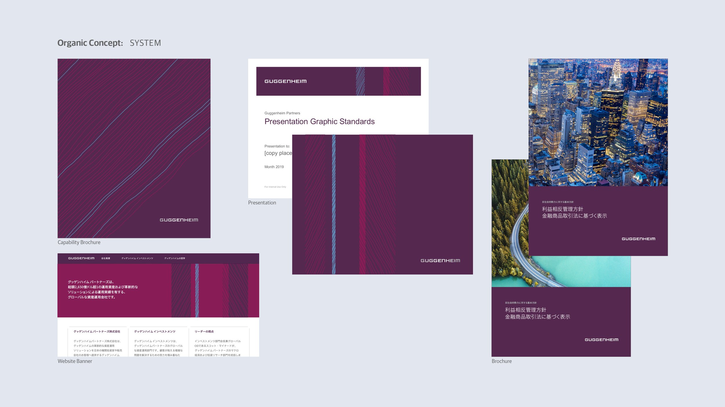
Design Direction: "Organic" Concept (Collateral Sample)
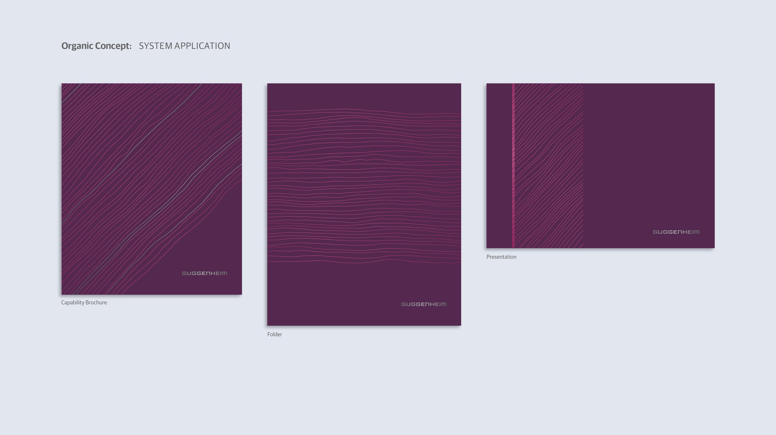
"Organic" Concept Application – Collateral Covers

"Organic" Concept Application – Stationery

"Organic" Concept Application – Calendar, Note Pad, Folder

"Organic" Concept Application – Thought Leadership Covers
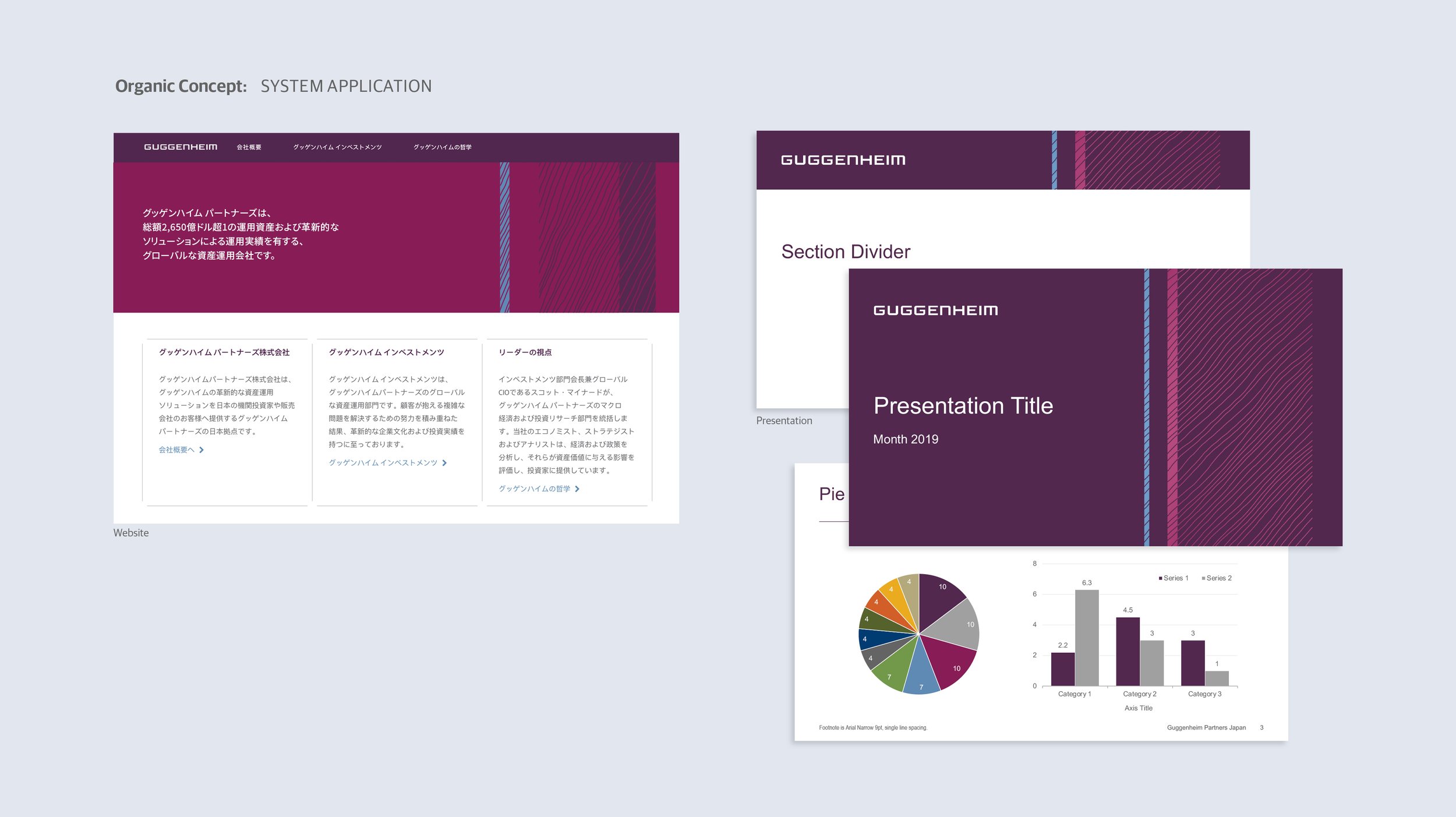
"Organic" Concept Application – Website, Presentation
